

At a glance, become aware of the world
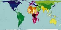
The starting point is a map similar to that made by Arno Peters in 1974. It is not the best known map, since the projection of Mercator is the most common. The map of Mercator dates back to 1569 and, although suitable for navigation, the size of the countries is distorted: the countries near the poles show proportionally greater surface than the equatorial ones. In the projection of Arno Peters depends on the surface of each country.
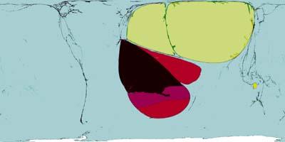
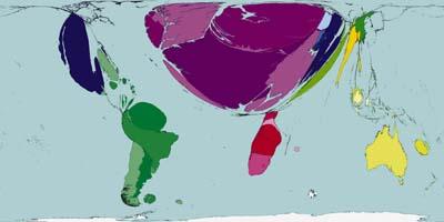
Worldmapper's have already produced nearly two hundred maps showing aspects of the population, displacement of people, transport, food, goods, manufactures, services, resources, fuels, production, work, income, wealth, poverty and housing. And they intend to do more. They will present aspects of education, health, disease and disasters. Later, as the United Nations collects and communicates the data, it seeks to capture aspects related to death, destruction, violence, pollution, exhaustion, communication and exploitation.
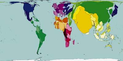
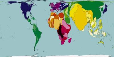
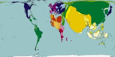
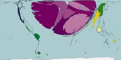
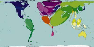
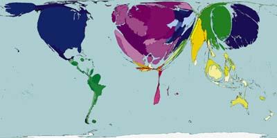
In Worldmapper maps, the size of countries not only represents the surface, but takes into account other factors. Therefore, the size of the countries appears disfigured according to the value of this factor in each country. For example, on the map representing the population, India, China and Japan appear huge relative to their surface, while Australia and Namibia are very small.
Easy to understand and comparable
Each map reflects a single factor in 200 territories. In order to compare maps with each other, these territories are always the same. Most of them are members of the United Nations, but few others include, so data corresponding to 99.95% of the world population are presented.
Colors also facilitate easy understanding and comparison of maps. The territories are grouped in 12 geographic areas, corresponding to each one a color. Then countries in the same area are darker or lighter than neighbors, and have the same color on all maps.
They also always try to preserve the appearance of countries, their borders with other countries and with the seas and oceans. In addition, the ocean has the same dimension on all maps and Antarctica also appears as a sea. All this helps to understand maps at a glance.
It should be noted that if the value of a factor is zero or negative, in a country that country does not appear on the map. To avoid the problems this may cause, many maps have been made two by two, complemented both maps. For example, maps that reflect profit and loss, or inputs and outputs complement each other.
Suitable algorithm
The process of making these maps has not been simple. Researchers have been trying to find a suitable algorithm for years. What the Worldmapper has created is fast and accurate and is based on a broadcast model. These models are used in heat transfer physics and molecular mixing, and here they are used to distribute the total surface of the map, discounting the value corresponding to the oceans.
Like maps, method, data reflected on each map, as well as additional information are available at www.worldmapper.org. Come in and see the thousand faces of the world.
Buletina
Bidali zure helbide elektronikoa eta jaso asteroko buletina zure sarrera-ontzian