

Map of nuclear risk
The first data that has been taken into account when making the map is the size of the population that lives around the centres. In this sense, the data are not very relaxing: in the world there are 211 centers, and around its three quarters of population lives more people than in the environment of Fukushima. That is, the power stations are located in places with a very high population density, taking into account that 172,000 people resided on the 30 km radius of the Fukushima Daiichi plant.
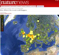
The Nature website has completed the map of the most dangerous places to be the scenario of a nuclear catastrophe.
Central Kanupp of Pakistan is the most populated of 30 km: 8.2 million. However, it has other factors that relieve gravity, such as having a single reactor and which is relatively small (125 megawatts). The same does not happen with the stations that continue in the ranking, since besides being a large population in the area, they are large facilities. Thus, around Taiwan's Kuosheng and Chin Shan power stations live 5.5 million people and produce 1,993 and 1,208 megawatts respectively.
In the map, the density of population around the central ones has been represented by color circles. The areas of higher density appear in red and those of lower density in dark green. Thus, in these centres there are red circles and other areas of East Asia, India and the Eastern United States. In these places there are many other circles of orange or yellow color. And Europe also appears painted orange and yellow, especially France.
A circle in Euskal Herria
In Euskal Herria there is a single circle: Garoña. It is green, but the clearest of the three greens of the scale, that is, the closest to yellow (after yellow comes orange and then red). This is, it seems, the color corresponding to the population that surrounds Garoña, with 0.07 million people in a radius of 30 km.
However, when calculating the risk, the authors of the map have taken into account other factors such as external threats. This has been called earthquakes, tsunamis, fires, floods, tornadoes and terrorist attacks. It is warned that it is not possible to predict it at 100%. Within Japan, for example, Fukushima is not the place with the highest risk of earthquakes and tsunamis. But there have been the largest earthquakes and tsunamis of the past.
Another factor is the measure. The bigger a central one is and the more reactors it has, the more serious the consequences of the accident. Garoña has a single reactor; if anything happened, we would only have to worry about one (and it would be). On the contrary, Fukushima's Daiichi has six, so the risk is six times higher. In fact, to a greater or lesser extent, it is the six that worry at this moment.
On the web are mentioned the culture of security, the design of the centres and the age. And age is one of the main points in the debates about Garoña. And this year it turns 40 years old, and that is the limit of the life of the centres in Spain. But the government decided it could continue functioning until 2013. Moreover, the company that owns the plant, Nuclenor, labor unions and mayors of some municipalities in the area, requested the extension of the deadline until 2019. But it does not seem to be the best time to fulfill your desire.
Published in Gara
Buletina
Bidali zure helbide elektronikoa eta jaso asteroko buletina zure sarrera-ontzian