Manu Ortega: "The key is to draw something that doesn't hurt in the eye"
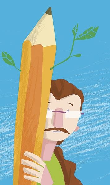
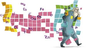
My work for Elhuyar magazine is special. More than science, it is dedicated to people of science. They are characters, so the documentation to be collected is mostly historical. For example, when science documentation has been introduced, unforeseen events have occurred. For example, to illustrate an article about Mendeleev, draw the character and back the periodic table of the chemical elements. Then we had to correct the illustration because some of the elements initially introduced in the table were not yet known at that time when Mendeleev lived.
The key is to create something coherent, something that does not hurt in the eye. Sometimes it is necessary to filter the information of the previous existing illustrations on the subject. If they are illustrated characters there will be many missing illustrations. But only to some extent. It must be consistent. And things that cannot be documented are a challenge, because they cannot be removed from the illustration, and at the same time they must be, at least in part, correct.
Yes. Sometimes I get lost in the documentation; I start reading, I get hooked on reading and forget that I have to make illustration (laughs). The truth is that throughout all this, there is a hypothesis that says that Leeuvenhoe was the model of Vermeer. And so, although Vermeer is not mentioned in the article, I decided that he would imitate his picture in the illustration.
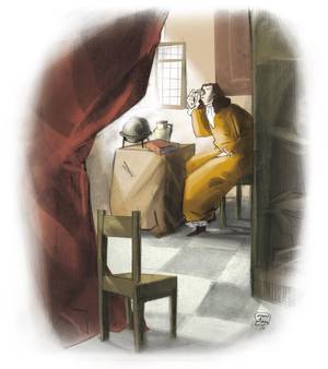
Sometimes I offer more data than is collected in the first reading and better for those who capture it; the works have infinite readings. The illustrations are not as defined as mathematical equations, they suggest many features and open up possibilities.
For many reasons. For didactics, for example, to understand a question well we need more than one type of explanation, and one of them is illustration. On the other hand, we live in the empire of the image and if we have no image we miss. It makes it more attractive and we feel more comfortable when there is an image. Many times it is an element that is there, like the background music of a bar, which we do not always pay attention to, but is there. And also, having space for the illustrator's interpretation adds a plus that is also information. If the illustration is done with great precision, it will be the information we can use. In some cases it may happen that the illustration opens new doors of investigation. In short, they are data, not so far from the concept of research.
Buletina
Bidali zure helbide elektronikoa eta jaso asteroko buletina zure sarrera-ontzian


