

Maps: world according to one
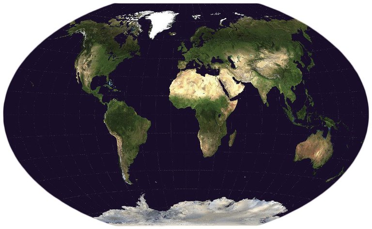
Although some do not like it, the map of Mercator is the best known and used. This is what Raúl Ibáñez Torres corroborates. Ibáñez holds a PhD in Mathematics, Professor of Geometry and Topology at the UPV and author of several books, including the book “Dream of the Perfect Map”.
According to Ibáñez, it is impossible to make the perfect map of the world, since there is no way to represent a sphere in a plane. “Leonhard Euler showed this inability in 1775, so he was probably suspected earlier. In any case, since then we know that all maps are faulty.”
For this reason, Ibáñez explained that the maps are made with specific objectives: “They basically seek that the most used maps are true to one of the following: surfaces, shorter distances or angles, that is, orientation. And it is impossible to make a map that keeps these characteristics at once.”
Mercator created his map for navigation in 1569. And for this, Ibáñez has emphasized that it is really practical: “Why? The loxódromos, that is, the curves of constant orientation, because they are straight lines. And this was very useful when they only had guide measures and compass, since they could not be constantly calculating the orientation.”
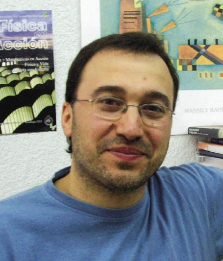
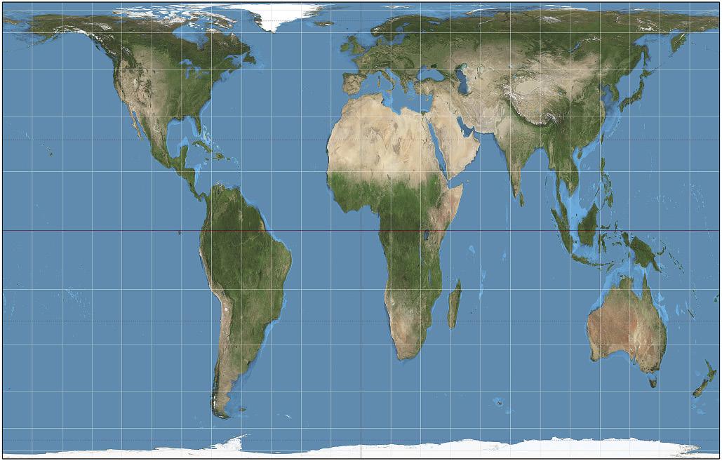
That is, therefore, the key to the success of the Mercator map: it is really useful for navigation. That is why it has spread so much. However, it also poses problems: “The countries of Greenland and the Northern Hemisphere appear disfigured and Europe appears as the center of the world, so some have strongly criticized it,” said Ibáñez.
But there are other maps like those that keep surfaces. Ibáñez puts as an example Lambert's: “XVIII. In the eighteenth century Lambert elaborates an isoareal map, that is, faithful to the surface. It shows the real distance between two points and it is very interesting for when you have to explain the real surface, but it does not keep the angles or the geodesica”. In addition, shapes, angles and distances are distorted little near the equator, but as they approach the Poles the distortion increases.
What objective, what map
From this century numerous maps have emerged, hundreds according to Ibáñez. “Several types have been designed: conical, cylindrical... And some are geometric, because they are geometric projections, and others are mathematical, that is, they are simple formulas. Everything is worth a good description.”
Thus things, Ibáñez has remembered that a map is used as well as another for what: “Imagine that you want to explain on a map the religions, languages or geological questions of the world. In this case, the ideal is to use an isoareal map so that the measure of the territories that appear is faithful to the real surface. Along with this, it will be necessary to have the least possible distortion in terms of its appearance, so that they can appear easily recognizable by the territory. Therefore, you will need a map with these characteristics.”
In other cases, maps of other characteristics will be necessary: “The ideal thing to navigate is to use a map with angles like that of Mercator. On the other hand, if you need to know which is the shortest distance between two points, for example, to introduce pipes or other infrastructures, then an equidistant map suits us. There is another example, ugly but true, and it is the need to know where it will fall and throw a missile, for it also uses an equidistant map”.
He adds that Mercator's transversal projections are widely used. They are used by planes and satellites, among others, because the routes appear in a straight line.
Ibáñez clarifies that when the representation of a small space is needed, a cross projection of Mercator, the UTM projection is also used. “UTM means Universal Transverse Mercator, widely used from a territory like Bizkaia for smaller areas. On the one hand, he is very faithful to his forms on a low level. On the other hand, the UTM is adapted to certain meridians, which allows choosing the projection according to the meridian that passes through the desired place. Therefore, it is ideal for making local maps, such as those of the mountains of a territory.”
Comments that Google also uses the map of Mercator. “Because when zooming the sites are not distorted. Therefore, it is true that Mercator's projection is not adequate to represent the whole world, although for it a lot is used and appears in many schools and books. But it is ideal for other uses.”
However, it may be the case that a map does not retain any of the main features mentioned and, however, is useful. According to Ibáñez, this is the gift of maps used by National Geographic. One of them is the projection of Winkle-Tripel. In fact, Winkle-Tripel replaced what they used until then, Robinson's projection in 1998, and became the basic map of National Geographic. After that, many other associations and entities have also done so.
Facts about map of Euskal Herria
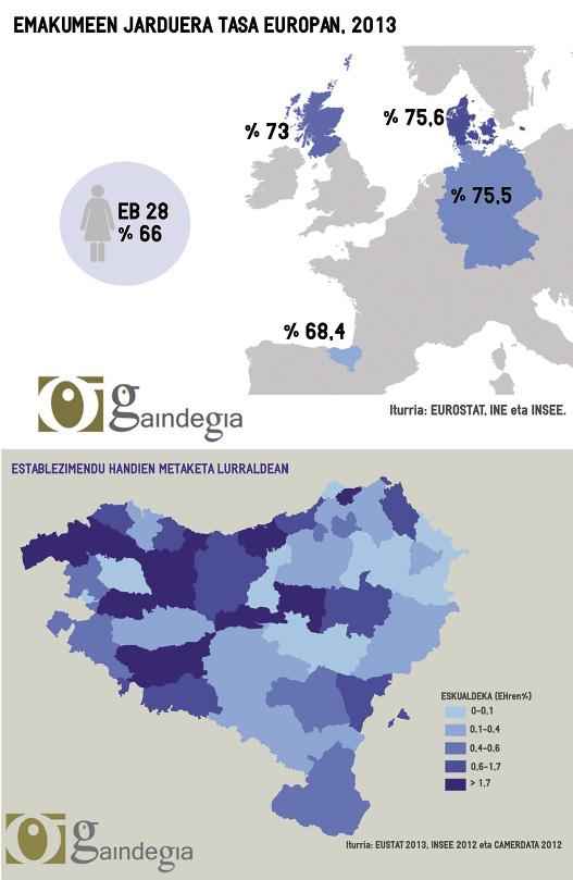
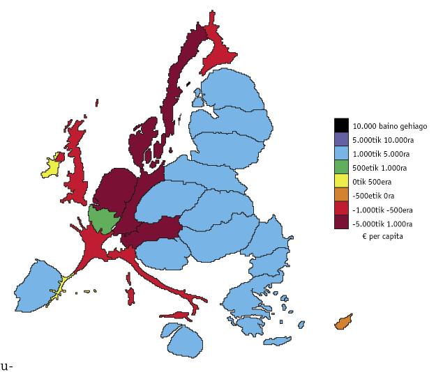
One of the most common uses of daily maps is to show socio-economic data. In the Basque Country, the Euskalgeo portal, created by the Gaindegia Observatory, is responsible for preparing and offering the spatial information of the territory, being responsible for it Mikel Aiestaran Olano, superior engineer of Cartography and Geodesia.
In the words of Aiestaran, “the classic concept of the map is overcome by different aspects and Euskal Herria also has to come to this new concept”. He explains that the map provides images of geographical reality with the sum of much information: “That geography can be both physical and economic, political... The novelty is that at present these elements can be used for analysis. To make decisions in different areas, it should be usual to analyze reality, performing complex operations in real time and obtaining graphical representations.”
He says that development is going very quickly from a technological point of view, “but in the case of Euskal Herria we have two problems: on the one hand, that statistical information is divided into three administrations and, on the other, that there is a lack of a digital spatial infrastructure that covers the whole of the Basque Country. Gaindegia carries out both works and offers them to the user following the criteria included in the INSPIRE regulation of the European Union”.
And, for Aiestaran, space data is fundamental to achieving the knowledge that requires the development of all society. Thus, the first work is to unify the cartography of the Basque Country. “Different projections are used in France and Spain, and to join them we need to work on information,” he said.
Once the database was created, they reflect socio-economic data. According to Aiestaran, this allows an analysis of the situation in Euskal Herria: “Thanks to these maps it is seen in a blow of eye that the Pyrenean reality and that of the left of Bilbao are radically different from each other.”
It should be noted that all the work they do is built on free software and made available to everyone. “Gaindegia wants to offer society tools to carry out its analysis in the way it wants.”
Aiestaran has indicated that Euskalgeo wants to be the infrastructure of all the spatial data of Euskal Herria. Thus, among other things, when the group of Natural Sciences of the UEU Euskalnatura created the cartography of landscape units, Euskalgeo incorporated it into its database.
On the other hand, he explains that according to the data they give, the representations are in one way or another: “The data can be punctual, linear or polygonal. These appear discreetly in surface, for example within each municipality. Thus are the rates of unemployment or fertility. The continuous data, on the other hand, cannot be expressed by points, lines or polygons, are continuous throughout the territory and an example of this is air pollution.”
In addition, as they have to adapt the projection, they have to adapt the data, since the Spanish Institute of Statistics and the French do not always express the data in the same way. For example, the calculation criteria for the unemployment rate are different in both cases. As an example of this, Aiestaran mentions a curiosity: In France they give the population data with ten.
After the putting in common, it proceeds to its territorial characterization. According to Aiestaran, this helps a lot to make decisions objectively. “For example, the age map of the population can be very useful to decide where to build a nursery or a nursing home.”
The way of expressing oneself is also varied. For example, the different qualities or amounts of a factor can be displayed through colors, as is done in the elections to show which match has been imposed on each territory, or to use color gradients.
He has now advanced that in Aiestaran, three-dimensional maps have also begun, and also those with a distorted surface according to data. “Here we enter the infographic section. They facilitate the interpretation of data and people have learned to interpret maps. This has greatly influenced the generalization of Google lemaps, which used only people who needed maps before, but now anyone observes and uses them.”
Map of Dymaxion
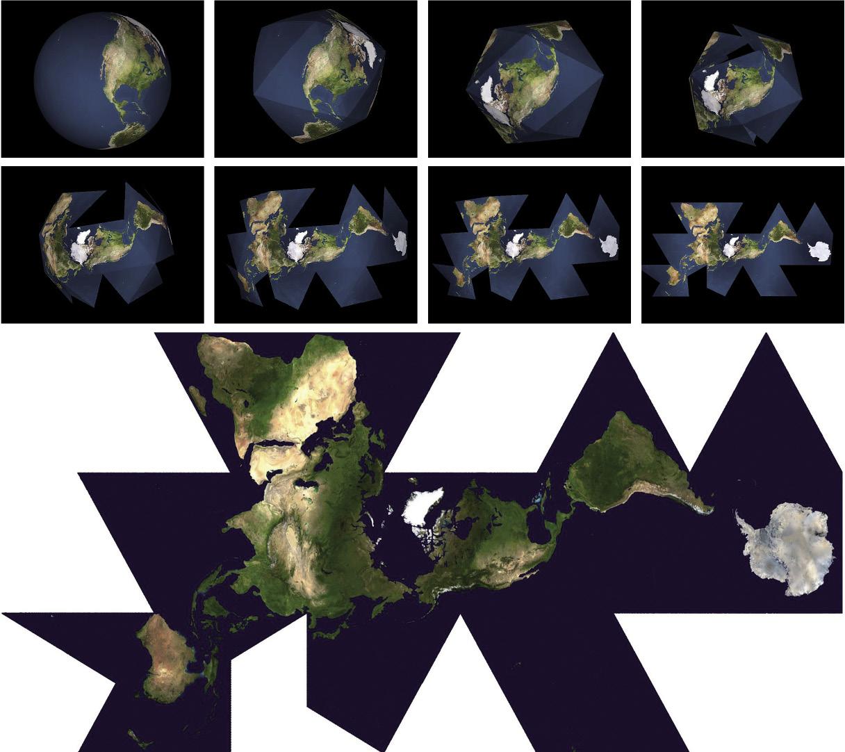
Among so many maps, it will not be easy to choose one. However, Ibáñez has one that he especially likes, the map of Dymaxion: “Designed by Richar Buckminster Fuller, it shows the shortest distance between two points, which does not seem so significant to me. What I like most is that it breaks the traditional representation of the north and the south. In addition, almost all territories appear united, like a large island, and the sea appears around them. That’s why I like it because all territories are connected and totally change the vision we’re used to.”
However, the map of Peters does not seem anything innovative: “In fact, this map already existed a century earlier, remains rectangular, the central meridian continues to pass through Europe, the surfaces are completely distorted... It didn’t change many things.”
The Dymaxion map, however, has a problem, according to Ibáñez: “It is so groundbreaking, not much has spread. This occurs with many inventions of Buckminster Fuller, which to the people of his time seemed too revolutionary.” However, other projections, such as those of Winkle-Tripelena and Goodde, also seem appropriate to him, and they say they are well known today. “Both are rounded and quite faithful to the surface.”
Buletina
Bidali zure helbide elektronikoa eta jaso asteroko buletina zure sarrera-ontzian