Text written in Basque and translated automatically by
Elia without any subsequent editing.
SEE ORIGINAL
At a glance, become aware of the world
2006/12/01
Galarraga Aiestaran, Ana - Elhuyar Zientzia
Iturria:
Elhuyar aldizkaria
It is not easy to imagine the world in two dimensions by being spherical. There will always be some distorted feature. However, this does not inexorably make maps. On the contrary, distortion can be used to make significant maps. For example, Worldmapper distorts countries' surfaces based on the factor they want to represent on the map. Result: representations that are understood at a glance.
At a glance, become aware of the world
01/12/2006 | Galarraga Aiestaran, Ana | Elhuyar Zientzia Komunikazioa
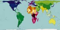
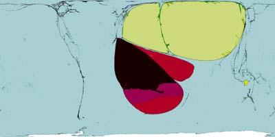
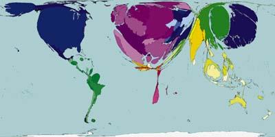
Map by area of countries.
Worldmapper
Worldmapper has been created jointly by Sheffield University (Great Britain) and Michigan (United States). The objective is to show in a graphic and understandable way various factors worldwide: population, fuels, resources, health status, etc. They use maps based on UN data.
The starting point is a map similar to that made by Arno Peters in 1974. It is not the best known map, since the projection of Mercator is the most common. The map of Mercator dates back to 1569 and, although suitable for navigation, the size of the countries is distorted: the countries near the poles show proportionally greater surface than the equatorial ones. In the projection of Arno Peters depends on the surface of each country.
Worldmapper's have already produced nearly two hundred maps showing aspects of the population, displacement of people, transport, food, goods, manufactures, services, resources, fuels, production, work, income, wealth, poverty and housing. And they intend to do more. They will present aspects of education, health, disease and disasters. Later, as the United Nations collects and communicates the data, it seeks to capture aspects related to death, destruction, violence, pollution, exhaustion, communication and exploitation.
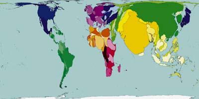
Current population. The map shows the distribution of the population. India, China and Japan are very large because of their large population. At the other extreme, Panama, Namibia and Guinea Bissau are barely visible, as few people live there.
Worldmapper
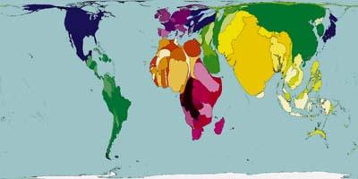
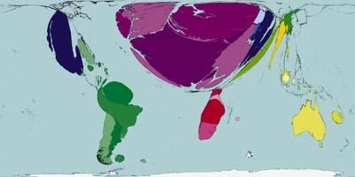
Population in the year 2300. Today we are more than 6 billion inhabitants in the world, but in 2300 it is estimated that they will be almost 9 billion. Africa expects it to be the fastest growing continent. However, China and India will remain the largest surface population and the United States and Pakistan.
Worldmapper
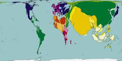
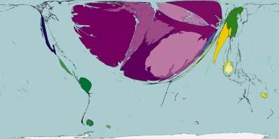
Growth of development. The map reflects the growth of the development index between 1975-2000. Growth occurred in almost all territories, but it is notorious what was experienced in China and India. Southeast Africa, North America, Western Europe and Japan have experienced similar growth.
Worldmapper
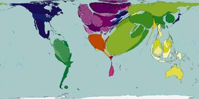
Loss of development. In the same period of time, development rates declined in seven countries: Afghanistan, Democratic Republic of the Congo, Iraq, Somalia, East Timor and Zimbabwe. Since 1975, the people of these territories have suffered wars, coups, droughts, plagues, economic catastrophe and international debt. Consequently, development indicators, i.e. life expectancy, literacy, schooling and gross domestic product, have declined.
Worldmapper
In Worldmapper maps, the size of countries not only represents the surface, but takes into account other factors. Therefore, the size of the countries appears disfigured according to the value of this factor in each country. For example, on the map representing the population, India, China and Japan appear huge relative to their surface, while Australia and Namibia are very small.
Easy to understand and comparable
Each map reflects a single factor in 200 territories. In order to compare maps with each other, these territories are always the same. Most of them are members of the United Nations, but few others include, so data corresponding to 99.95% of the world population are presented.
Colors also facilitate easy understanding and comparison of maps. The territories are grouped in 12 geographic areas, corresponding to each one a color. Then countries in the same area are darker or lighter than neighbors, and have the same color on all maps.
They also always try to preserve the appearance of countries, their borders with other countries and with the seas and oceans. In addition, the ocean has the same dimension on all maps and Antarctica also appears as a sea. All this helps to understand maps at a glance.
It should be noted that if the value of a factor is zero or negative, in a country that country does not appear on the map. To avoid the problems this may cause, many maps have been made two by two, complemented both maps. For example, maps that reflect profit and loss, or inputs and outputs complement each other.
Export of alcohol and cigarettes. 0.9% of the money moving on the international market comes from alcohol and cigarettes, and two-thirds of the net export corresponds to the territories of Western Europe, especially France and the Netherlands. Behind, South America, where Chile stands out.
Worldmapper
Export of medical products. 3.2% of export profits are for medicines. This map considers not only medicines, but also other medical issues such as appliances and appliances. Three quarters of the benefits generated by the export of these materials come mainly from the countries of Western Europe, Ireland. Outside of Europe, China, India, Mexico and Singapore appear on the map, but they are quite small.
Worldmapper
Fuel export. The fuel export map has been made taking into account all fuels: oil, gas, coal, nuclear energy and traditional fuels. The largest exporters are Saudi Arabia and Russia, both located in the Middle East, and thirdly Norway, in Western Europe. They mainly export oil and gas.
(Photo: Worldmapper)
Import of fuel. The territories that matter most are Western Europe and North America. At the other extreme, Central Africa is the least fuel important. Per capita, Singapore and Bahrain are the main importers. Singapore is a major commercial port for a long time, Bahrain imports crude and exports refined. In fact, the fuel imported by Western Europe comes largely from these two countries.
Worldmapper
Suitable algorithm
The process of making these maps has not been simple. Researchers have been trying to find a suitable algorithm for years. What the Worldmapper has created is fast and accurate and is based on a broadcast model. These models are used in heat transfer physics and molecular mixing, and here they are used to distribute the total surface of the map, discounting the value corresponding to the oceans.
Like maps, method, data reflected on each map, as well as additional information are available at www.worldmapper.org. Come in and see the thousand faces of the world.
Galarraga de Aiestaran, Ana
Services
226
2006
Description
032
Social Sciences
Article
News