

Are you going to read, yes or no?
Why have you decided to read this article? Will you read it to the end? Do you understand and within fifteen days will you remember what you read today? The answers to these questions would be in the characteristic that is called “readability”, that is, that being or not interesting the subject, having a clear argument, that the letter and the presentation are attractive,... But psychologists are discovering why people read the technical information, and often do not read it, what must be taken into account is the reader and the reading is not so important.
The topic we will use here is that of technical information, that is, reading manuals, instructions, contracts, tags, consumer information, etc. We take the opportunity to comment on the curiosity that has arisen in manufacturers of certain products on these issues, since it is necessary to read the instructions for their correct use. Research on the “readability” of the technical texts has been carried out in order to publicize the safety standards to the inhabitants of the environment of the nuclear power plant, avoid the costs of insurers for poor compliance with the printed materials, etc.
It is evident that many people put aside the instructions of the video or home computer in order to start it and learn how to use the tool. And often no attention is paid to consumer information, food labeling or the small print of contracts. How do we then decide if something is worth reading?
Psychologists who analyze the reading process do not match the role of the eyes, memory and brain in this process. According to some theories, the reader takes into account all the letters or words he sees. Others consider that the reader uses memory and context to move from one sentence to another.
On the other hand, it is evident (and in this sense there is a greater consensus among experts) that the reader will have a different attitude to the text, with respect to what its objective is, to what kind of information it wants to obtain. You may want to take all the details of a complex operation or, on the contrary, want to read from the skin. You can use different reading styles for: surface reading, detailed reading, etc.
Seeing how people use technical information shows that the brain reprocesses from abstract to concrete. As has been seen in various investigations, a manual or manual, for example, if at first it offers general information, more than one reader will try to start from there and put into practice the read and will not read other information. It seems that readers prefer the information offered as a “cookbook.”
They prefer information divided into quantities and procedures so that they can visualize it and put it into practice. It is clear, on the other hand, that novice computer users prefer to ask someone else for help than to start directly with the manual.
Version AJakob had twelve children. Children of Lia: Ruben (Jakob wholesaler), Simeon, Levi, Juda, Isakar and Zabulon. Sons of Rakel: Joseph and Benjamin. And the sons of Bilhah, the maid of Rachel: Dan and Neftali. And the sons of Zilpa, the maid of Lia, Gad and Asher. These are the sons of Jakob, born in Padan-aram. Version B
|
Organization of information
Several studies have been carried out with the text interspersing diagrams. In these studies it has been observed that when reading technical information it seems that people have a mental system to calculate the cognitive cost, that is, the effort they have to make to become aware of information. If the reader sees that additional information will make memory or understanding difficult, for example, they will discard this information. The reader starts reading for a certain purpose. Constantly discuss whether you are near or away from that initial goal. If you think you are moving away, you can simply decide to keep it.
Commissioned by the British Library, a study was conducted on the response of readers to save texts on computers. In this study we wanted to know how readers calculate the reading cost to assess the possible differences between paper and computer screen. As has been seen, when readers do not know the burulan they are going to have, they move even less away from their main initial goal.
Readers who have the text on paper have the possibility to use the number of pages, to go back and move forward on pages, sometimes underlining and writing notes in margins. Those who read on screen without this kind of help are lost in this group of texts and tend to leave the text before anyone else. On the computer it was considered necessary to include the page number and facilitate the reverse, but nevertheless users had greater difficulties in calculating the cost, so they remained more aligned with the initial objectives and, therefore, stopped reading more easily, not worth it.
And if readers see that they are not going to find anything they need or seem to them, they think that the cost of reading is not worth it and therefore they will leave that text aside. This means that people who write technical information and information for consumers (at any level, from sweet paper to nuclear safety manuals) and customers who want to read such information will have to take into account the cognitive cost of the reader (what the reader expects from the instructions).
Warning flashes are also used to indicate that the processing of this information section is worthwhile. But it should not be abused either, since the reader begins to include these warnings within the calculation of mental effort, so he will reassess whether they are worth it or not.
But there are several more sophisticated ways to design the information for the reader to assume the cost.
Some of them are established in typography. For example, italics are harder to read.
On the other hand, the “justification” of the text (that is, the fact of taking all the lines to the margin, extending the space between the words or dividing the words) increases the tension in the reader’s understanding. The cognitive cost is higher when readers have to transport half a word from one row to another, or the first word from one sentence from one page to another, for example. Through evidence of a justified and unjustified text, it seems that adults read the same thing as with two types of texts. However, children and adults read better when the text is organized by forms (and not by meaning).
The space can also be used to express the structure of a text (see figure 1). One study showed a group of readers version A and another group were invited to write in memory version B and reading. Everyone managed to rewrite the text, although they did not take the same fragment literally. Readers of both groups were adults and, so to speak, “good” readers. By doing similar tests with children (for which simpler text was used), those with a type B text exceeded the results of group A by 20%.
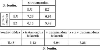
The idea of identifying and explaining the underlying structure would be equally applicable to the information contained in tables, graphs, images, etc. The clearer the structure of a table, the easier it will be understood. (See 2 and 3. images) In one of them, the reader must deduce, through comparisons, a horizontal and descending reading, which is the control group and draw conclusions. In the second it is clear what the control group is, the results can only be read in one direction and the numerical progression facilitates comparison.
Graphic design
As for graphic design, it seems that the use of a different color in the lines of the charts and the use of four-sided graphics (and not only two-sided) has a utility to obtain more accurate information.
The drawbacks of readers with tables often refer to the position of the table in the text. Drawing or other non-textual information already mentioned in the text seems to increase the cognitive cost for readers.
Nobody knows how concrete we calculate the ability to process and how we compare it with costs, but it is evident that it also influences the behavior of the image itself: if a person thinks that it is a person who can immerse himself in the technical information, the reading will be longer than the one who thinks otherwise (who is not able to find the leg or the head).
To finish and summarize, let's say that those who write technical information have to take into account what readers should write for. And on that path we must take into account three questions: What do users know before encountering the information? What happens when you find information? (To what extent is it understood and what help or hinders?) And what happens next? (How do users implement their final knowledge? ).
Buletina
Bidali zure helbide elektronikoa eta jaso asteroko buletina zure sarrera-ontzian