
Text written in Basque and translated automatically by Elia without any subsequent editing. SEE ORIGINAL
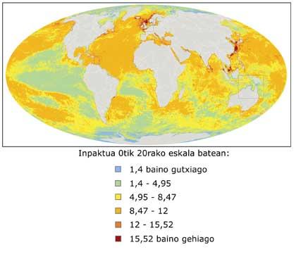
Map of the average sea level rise
2012/09/25 Carton Virto, Eider - Elhuyar Zientzia Iturria: Elhuyar aldizkaria

Ed. Information
The map consists of data collected between 1993 and 2012. The map shows the average variation of sea level in this period, expressed in colors. From blue to red, from the areas that have suffered the descent to those that have suffered the greatest climb.
The global trend is rising, with an average global sea level rise of 3 mm/year (yellow). By regions, however, there have been increases and declines. In the Philippines, for example, every year the sea level has risen more than 10 mm on average. The Caspian Sea is at the other end.
--> Watch ESA video
The map has been compiled from radar altimetry data from several satellites and has been presented at the congress "20 years of development in altimetry by radar" held these days in Venice.
eu es fr en ca gl
Gai honi buruzko eduki gehiago
Elhuyarrek garatutako teknologia